Studies have shown that users take as little as 50 milliseconds to form an opinion about a website [1]. Websites play a crucial role in the success of a business. If designed well a business website can build credibility, trust and acquire new leads. A poorly designed website can lead to a business losing potential clients. 57% of users say that they will not recommend a business that has a poorly designed mobile website [2]. To ensure that your website is up to scratch and not costing you leads, you should work with a professional website design company in Trinidad.
An experienced website design and development company will know how to create a website that is appropriate for your business, is easy for users to navigate, and can effectively capture leads. In this article, we explore the golden rules of layout and design that all website services companies in Trinidad should follow.
1. White/Negative Space
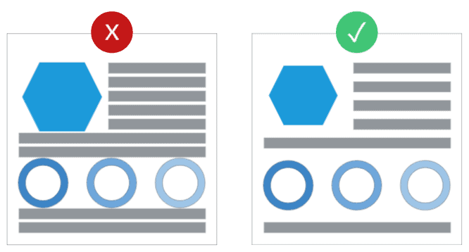
What’s not on a website’s page is just as important as what is there. White space is the empty space between design elements. Without proper white space, your website can look cluttered and overwhelming. The space between lines of text, margins, padding around images, the separation between different sections, are some of the most important places to have adequate whitespace.

2. Hierarchy
Hierarchy helps users make sense of a design. It groups related elements together visually and helps users understand the flow of the design. All the design elements on your websites should have the correct hierarchy. The easiest way to understand this principle is to think of text. Your most important heading on the page should be the most prominent, the sub-headings should be smaller and the body text the smallest. You can communicate hierarchy by playing with font size, weight, and color. The same is true for other design element like size, colour, and placement which can be used to establish the visual hierarchy of a design.

3. Proximity
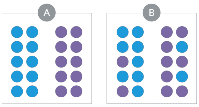
Closely associated with the principles of negative space and hierarchy is proximity. Placing elements close together can help visually group them. While increasing the whitespace between them can establish separation. In the example below, in figure A, the dots are separated on the basis of colour. In figure B we can see how proximity can help overpower that signal of distinction and help communicate grouping.

4. Repetition
Repetition is the use of similar elements throughout a design. It helps create a sense of cohesion and unity in the design. Your website should have consistency in style and choice of elements. You can implement repetition through the use of fonts, similar style images and, shapes. Remember that overusing repetition can make the design boring, remember to keep some dynamic elements in your website design. Use repetition to create a rhythm, not a flat pattern. In the example below the circle shape and the colour blue are used to create repetition.

5. Contrast
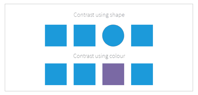
Contrast can be used to emphasize what is important on your website. An easy way to understand this principle is to think of Call to Action (CTA) buttons. You want these buttons to stand out so that users are more likely to click on them. Hence, they should be in a contrasting colour to the rest of the website. Colour, size, and space are the attributes of website design that help create an impactful contrast. Thus, through proper and thoughtful implementation of design attributes, an experienced website design company can also help your business generate higher website conversions. Read more about 3 crucial ways your website design company supports your business.

6. Alignment
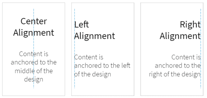
This is an important principle that affects how professional and polished a website looks. All design elements should be properly lined up so that they look intentional. We look at things from left to right and top to bottom. The principle of alignment can make use of this trait to present the website elements in a coherent order so that things don’t look out of place.

A good design has a huge impact on whether or not users will interact with your website. If your website is not helping you acquire customers it might be time to consider bringing in a professional like WebFX. WebFX is a website design and development company in Trinidad with years of experience working with businesses in Trinidad as well as several Caribbean and South American countries. The years of experience in website design and digital marketing allows us to create high-quality websites that are both search engine and user friendly and in alignment with our clients’ business goals.
Sources:
1. Feb 2021, G. Lindgaard, G. Fernandes, C. Dudek & J. Brown,“Attention web designers: You have 50 milliseconds to make a good first impression!”, Taylor & Francis Online, [available online] available from: https://www.tandfonline.com/doi/abs/10.1080/01449290500330448 [accessed Jun 2021]
2. 2015, B. Ruby, “The 5 Mobile Marketing Mistakes Infographic”, socPub, [available online] available from: https://socpub.com/articles/the-5-mobile-marketing-mistakes-infographic-14849 [accessed Jun 2021]


