
Most visitors leave a website after eight seconds. So, website designers must prioritize user interfaces and content to meet users’ needs1. For web designers, mastering the principles of effective website layout can make the difference between a mediocre site and one that truly stands out. Let’s take a look at the golden rules and best practices for web design that can help you achieve a professional look and offer your visitors an outstanding user experience.
1. Hierarchy
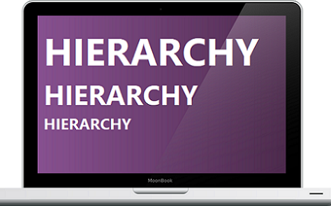
Hierarchy is a fundamental principle in web design and development that helps users navigate and understand the information presented on a website. By organizing content in a way that guides the viewer’s eye through the page, you ensure that the most important elements are noticed first. For instance, headings should be more prominent than subheadings and body text should be the least prominent.
Design elements like size, colour and placement must be used effectively to establish a clear visual hierarchy. Placement plays a key role in website layout design. According to a study by the Nielsen Norman Group, users spend 80% of their time looking at information above the fold, so placing key messages and calls to action in this area is crucial.
2. Proximity
The principle of proximity involves grouping related elements together while separating those that are not related. This helps users quickly identify relationships between items and navigate the site more intuitively. For example, placing an image near its description or keeping contact information in a single section helps maintain clarity, coherence and quick access to related information.
Spacing is another important proximity tool used to give websites a refined and professional appeal. Research from the Journal of Usability Studies highlights that well-spaced layouts significantly improve user satisfaction. On the other hand, a cluttered layout can confuse visitors and lead to a higher bounce rate. Therefore, a web design company must pay attention to the proximity principle and use adequate spacing between different sections to improve readability and to enhance the overall user experience of the website.
Read more on key principles for business website design in Trinidad.
3. Repetition
The principle of repetition is used to create a sense of cohesion and consistency throughout the website. By repeating certain design elements like fonts, colours and shapes, web designers can establish a unified look that reinforces your brand’s identity and personality. This practice not only makes the site more aesthetically pleasing but also helps users familiarize themselves with the look and feel of the website, further enhancing navigation and functionality.
For instance, using the same button style for all call-to-action buttons can make it easier for users to recognize clickable elements. Consistency in design is a hallmark of professionalism and can greatly impact user trust and engagement.
4. Contrast
Contrast in website design is used to highlight the most important parts of a website. By using contrasting colours, sizes and shapes, web designers can draw attention to key elements such as call-to-action buttons, headlines and important links. High contrast between text and background also improves readability, especially for users with visual impairments.
According to a report by the World Wide Web Consortium (W3C), proper contrast can significantly enhance accessibility, ensuring that your website is usable by a broader audience. For example, using a bold colour for a sign-up button against a neutral background can make it stand out and attract more clicks. Use of contrast is a simple yet effective website design practice.
Learn more about how to design a business website that combines visual appeal and effectiveness.

5. Alignment
Alignment refers to the arrangement of elements so that they are lined up along a common axis. Proper alignment gives a sense of order and balance to the website, making it look clean and organized. Whether it’s left, center, or right, keeping the alignment consistent throughout the website is key to achieving a professional appearance.
Misaligned elements can make a website appear disjointed and amateurish making users question its credibility and trustworthiness. By ensuring that text, images and all design components are properly aligned, web designers can create a cohesive and polished look. A study by the Stanford Persuasive Technology Lab found that 46.1% of people assess a website’s credibility based on its visual design, highlighting the importance of alignment.
Read more on the features of a website with an exceptional UX design.
Partnering with a professional website design company
For businesses in Trinidad and the Caribbean, working with a professional website design company can help ensure that these principles are effectively applied. A website design and development company with experience in the region will understand local market needs and can tailor the website’s design to meet specific business goals.
For instance, website design agencies in the Caribbean often focus on creating vibrant, dynamic websites that reflect the rich cultural heritage of the region while adhering to these design principles. This approach not only appeals to local audiences but also helps businesses stand out in a competitive market.
In conclusion, understanding and implementing the golden rules of website design—hierarchy, proximity, repetition, contrast and alignment—can greatly enhance the functionality and visual appeal of a website. By prioritizing these principles, web design agency can create websites that are attractive, user-friendly and effective in achieving business objectives.
If you are looking to update the user experience and user interface of your business website design, contact us at Webfx Trinidad office. Our experience working with a variety of businesses in the Caribbean has given us the expertise to create websites that are specifically designed to cater to the needs and preferences of the audiences in Trinidad and the Caribbean region.
Source:
- N.d., “Website Design for Higher Conversions – A Quick How-To Guide”, UXPin, [available online], available from: https://www.uxpin.com/studio/blog/how-to-design-your-website-for-higher-conversions/, [accessed Jun 24]